Program Branding - Global Settings
When you first install Raleon, our Copilot AI automatically analyzes your branding, the products you sell, and more. Through that analysis, Copilot is able to understand your brand colors, your brand voice, and your store's style overall.
It applies that knowledge with a default set of branding colors and text that are designed to match your store beautifully. These defaults can of course be changed anytime through Raleon's Loyalty Branding features.
Raleon gives you tremendous control at the program level across your store, as well as granular control over specific Campaigns, Ways to Earn, and Rewards.
You can adjust, change, and manage these settings at anytime.
Update Program Branding
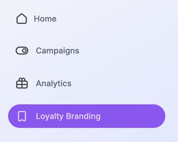
To manually update your Program level branding, first navigate to the Loyalty Branding section in the left hand navigation on the Raleon app.
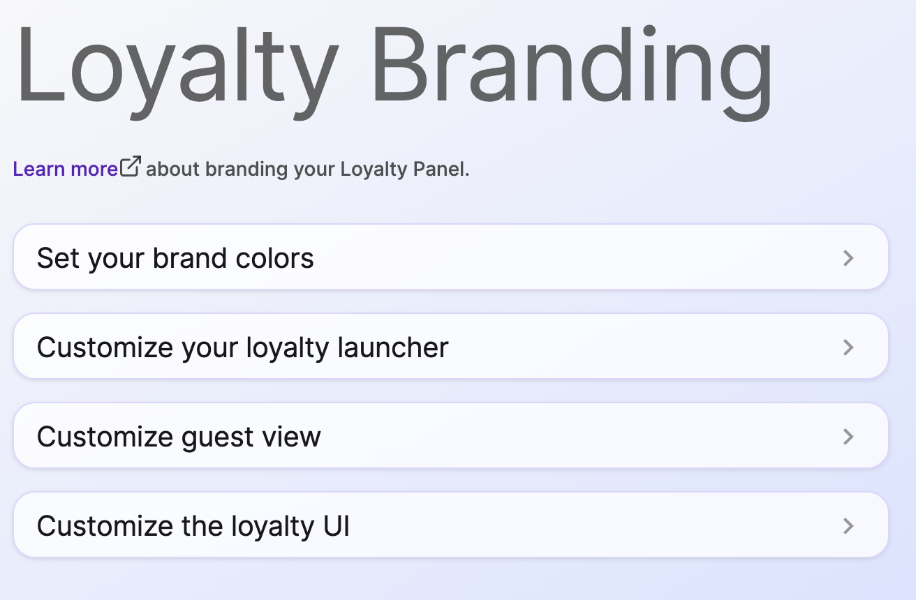
These page gives you the ability to update your brand colors, customize how the Loyalty Launcher appears when minimized, and the Loyalty Sidebar when viewed by Guests, and the Loyalty Sidebar for signed-in program Members.
Each of these settings can be expanded or collapsed in the main area of the page, making it easy to make updates and review the Preview efficiently and comprehensively.
Loyalty Branding Preview
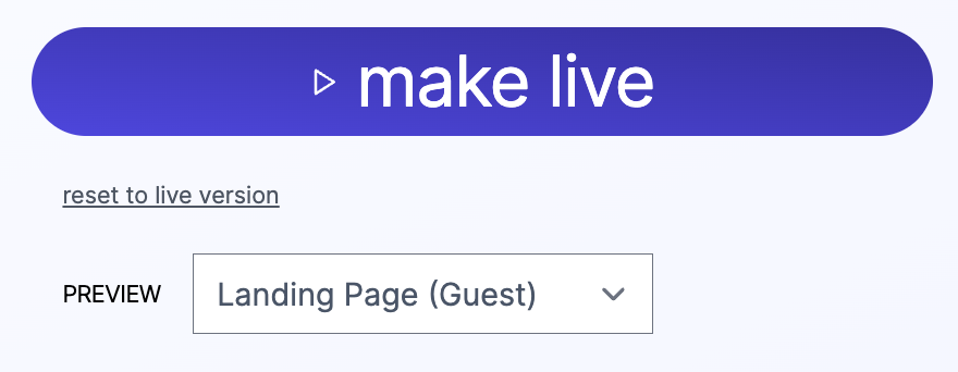
As you are updating your Brand settings, Raleon updates a live preview view of the Loyalty Launcher and/or the Loyalty Sidebar so that you can see what your changes will look like before you make the changes live.
To toggle the view between the Loyalty Launcher, Guest, and Member views, select the drop down menu above the preview. This allows you to easily see and feel how your Loyalty Sidebar will look to your customers prior to setting the changes to live.
At any time prior to clicking "Make Live" you can click "reset to live version" to revert your changes back to the currently live settings.
When you make a change in the Loyalty Branding settings, those changes will not go live on your store until you click the "Make Live" button on the right side of the page.
Update Your Brand Colors
Your brand colors are the foundation of your visual branding both in your store and on the Raleon Loyalty Sidebar. The platform gives you control over your main colors as well as your second and tertiary branding.
Each of the color choices available in the settings can be set manually by clicking on the color wheel for each, by HEX, RGB, or HSL. Raleon also includes a Dropper feature so you can select any color on the page with a single click.
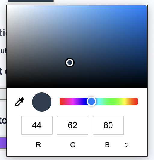
Click this icon on the bottom right of the color picker to rotate between RGB, HSL, and HEX options.

Customize the Loyalty Launcher
The Loyalty Launcher can be customized in a number of ways to fit your store. Expand the Loyalty Launcher menu to adjust:
- Your Logo or Favicon image that appears on the Launcher. Raleon Copilot will default this image for you based on your store during onboarding, but it can be changes at any time. Raleon allows you to use any image from our library or you can upload your own.
- Launcher Position - You can set the Loyalty Sidebar to sit on the lower left or lower right of your store. By default, the Loyalty Launcher and Loyalty Sidebar will be on the left.
We advise keeping the Loyalty Sidebar on the opposite side of the Cart to avoid UI conflicts and user confusion during checkout.
- Loyalty Launcher Call-To-Action - You can change the copy that appears on the Loyalty Launcher beside your logo. This text only appears on the Loyalty Launcher. Copy elsewhere in the Loyalty Sidebar is updated independently.
- Loyalty Launcher Colors - You can also change the background and text colors of the Loyalty Launcher here.
Customize the Guest View
If a customer has not signed in, they will see the Guest View after expanding the Loyalty Launcher. The guest view is designed to showcase why they should sign in and join the program. It gives you a surface to describe your program and it's benefits.
This view uses your brand colors and allows you to update the Hero Image, Title, Subtitle, and Benefits Title.
Hero Image - Select a default image from our library or upload your own.
Title - The title appears immediately below the Hero Image. It is the primary text of the Guest view and your opportunity to grab the customer's attention.
Subtitle - The Subtitle text appears next in a slightly smaller font. Use this text to expand on the title, communicating your programs value to your prospect.
Benefits Title - The Benefits Title appears next, just above the Join and Sign In buttons.
The Title, Subtitle, and Benefits Title each have a 40 character limit.
Customize the Member View
After a customer signs in, the Guest View will be replaced by the Member view. This view allows the Member to see their points balance, discover Ways to Earn, Redeem rewards, and apply them to purchases.
Raleon gives you control throughout the Member experience to update copy, calls to action, and include your own brand-specific language and images.
Loyalty UI Header - This appears in the top bar of the Loyalty Sidebar.
Title for rewards a member has - This represents the Rewards that a Member has been granted or redeemed but not yet applied to a purchase. In other words, this section shows the rewards that the Member has already earned.
Title for the ways a member can earn - This gives you the ability to update the language your brand uses to describe the various Ways to Earn available in your Program.
Title for rewards a member can get - This area shows the Member the rewards that are available for them that they have not yet redeemed. This is similar to a "rewards store" with the available benefits that they could spend their points on.
Updated about 1 year ago